

start a project

close
Boltz AI models screen small molecules and design proteins, running inside the tools scientists already use. The brand system behind that work was carefully built and thoroughly documented, across logotype, color, typography, graphic elements, photography and applications. What it did not yet cover was the work Boltz most needed to show.
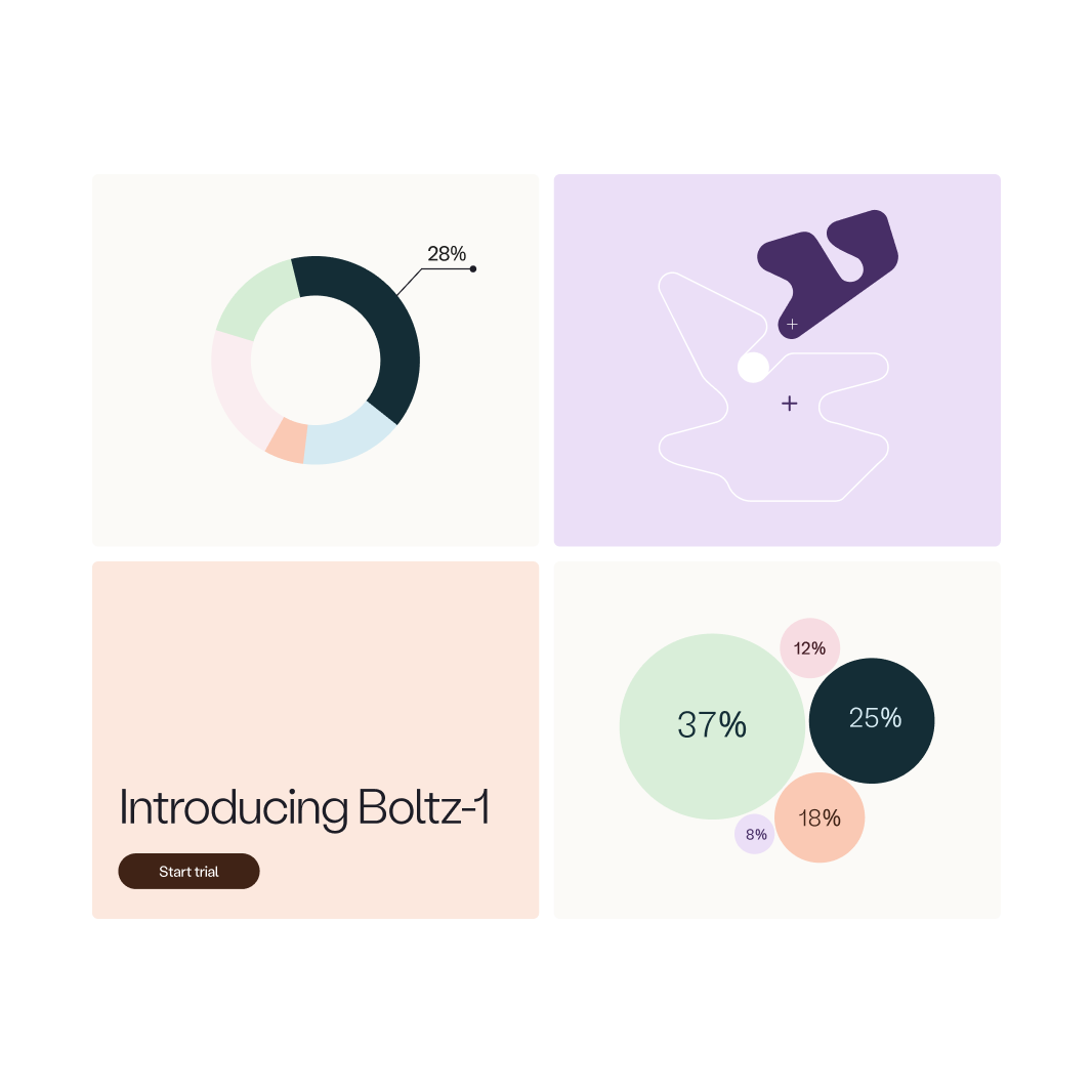
There was no way to represent the molecules themselves, and not enough color to build data visualizations without stepping outside the brand. Boltz came to us to close both, ahead of the launch of BoltzMol-1 and BoltzProt-1. The task was to turn two computational models into visuals an audience could understand on sight. We worked from the brand guide they already had rather than around it.

Molecular renders tend to pick a side. The academic default is rigorous and cold, with sterile surfaces and color assigned differently every time. The friendlier alternative smooths the science away. Boltz wanted neither.
The subjects vary enormously as well, from a small molecule to a multi-chain assembly, and two models had to read as distinct from one another while still reading as one platform. A structure with several components needs a distinct color role for each, which is where three hues ran out.
We treated approachability and rigor as layers rather than as a choice. An outer form that invites a general reader, an inner structure that holds what a specialist needs, both in the same image so neither has to be given up for the other. The same logic carries the platform. What stays constant across the two models is what they share. What changes inside is what tells them apart.
In practice that is a molecular surface at loose contours across both, with the representation inside it set by what each model works on. Stick for BoltzMol-1 and its small molecules, ribbon for BoltzProt-1 and its proteins. The system carried through the launch animations for both, and the palette was extended alongside it, with more tints and shades inside the hues Boltz already owned and hues beyond them.
The work left Boltz with expanded visual identity standards for how it represents its science. Extending the palette is now repeatable and on-brand instead of improvised, and the same visual language holds whether the subject is one molecule or the platform as a whole.
Boltz AI models screen small molecules and design proteins, running inside the tools scientists already use. The brand system behind that work was carefully built and thoroughly documented, across logotype, color, typography, graphic elements, photography and applications. What it did not yet cover was the work Boltz most needed to show.
There was no way to represent the molecules themselves, and not enough color to build data visualizations without stepping outside the brand. Boltz came to us to close both, ahead of the launch of BoltzMol-1 and BoltzProt-1. The task was to turn two computational models into visuals an audience could understand on sight. We worked from the brand guide they already had rather than around it.
We are excited to hear from you. If you have any questions, comments, or project inquiries, please don't hesitate to get in touch with us.


